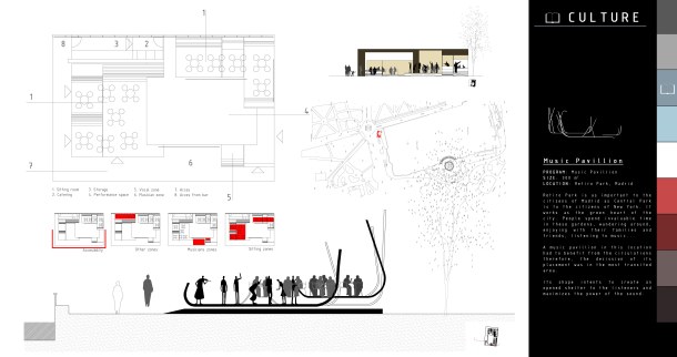
Among all types of designers, architects have proven to be especially picky in terms of typography. Mies van der Rohe once stated “God is in the details” and apparently us architects pay a lot of attention to the fonts we use. However, we are loyal only to a few. According to a survey I’ve been doing this week, there are 5 fonts architects can’t do without, regardless of our nationality and where we’ve studied. Have a look!
______________________________________________________________
1. ISOCPEUR
______________________________________________________________

Download: Isocpeur
2. HELVETICA NEUE
______________________________________________________________


Download: Helvetica Neue
3. COURIER NEW
______________________________________________________________

Download: Courier New
4. OSTRICH SANS
______________________________________________________________

Download: Ostrich Sans
5. EAGLEFEATHER
______________________________________________________________


Download: Eaglefeather
Other fonts architects like are: Avantgarde, OCR, Arial, Bauhaus 93, Gill Sans and Proxy
If you liked this article you may also like 9 Successful Colour Combinations for Web and Graphic Design


How intriguing! Courier New would be my favourite of the five and Eaglefeather would be my second choice.
LikeLike
I love all of those, couldn’t have a favourite haha. However, I’ll admit all of these fonts have very similar features: simple but elegant. “Less is more” I guess. Did you know Eaglefeather was inspired by the handwriting of Frank Lloyd Wright?
LikeLike
I didn’t know Eaglefeather at all till just now. But that is interesting. Fonts create such an important first impression. Have you heard of the work of Eric Gill, long ago?
LikeLike
Actually I don’t know much about Eric Gill besides being a typeface designer. Any curious facts?
LikeLike
Very nice analysis–I knew of Eaglefeather (because of FLW), and 2 and 3. But 1 and 4 are new-minted in my eyes. I really like the long modernism of Ostrich–makes sense.
LikeLike
Isocpeur is my favourite font ever :)) I always use it for everything. And that is exactly what I like of Ostrich Sans, that is a modern font in a very classic ways! Do you like any other fonts that aren’t here?
LikeLike
Back in the 70s when I was in school Microgramma was all the rage 🙂
LikeLike
I had to Google that one. Like it a lot actually, it’s classic and elegant 🙂
LikeLike
¡Cuidado! El enlace de la Helvetica lleva a EagleFeather.
Otra que he visto MUCHO es INTERDIMENSIONAL (se me olvidó ponerla en la encuesta!)
un beso
LikeLike
Marta! Gracias por el detalle, ya está corregido. No la conocía pero me encanta. Soy una obsesa de la tipografía así que descubrir algunas nuevas me encanta. Sí se te vienen a la mente otras ponlas por aquí 😉
Muacs
LikeLike
Virginia, this is a side of things in architecture that I hadn’t considered. I can certainly see that for architects, that when it comes to fonts, “less is more”. Didn’t Mies van der Rohe say that as well? ~James
LikeLike
Haha he did, “Less is more” is another quote by Mies and I guess it reflects the style of those fonts too- no ornament or strange curves are allowed. Do you like any other fonts that aren’t on the list?
LikeLike
I must admit that I’m woefully ignorant of fonts Virginia. I usually just go for readability and simplicity. Terri (the creative part of Gallivance) is our font expert. ~James
LikeLike
WHAT!? . . . no Comic Sans?
LikeLike
Hahah!! In fact, I am unable to read any text on Comic Sans, I get distracted by its form!
LikeLike
See, I don’t get that . . . the argument above is predicated on being aware of the fonts, not vice-versa.
As such, I don’t know what makes Comic Sans an awful typeface. The only explanation I heard that makes somewhat sense is that it was overused (whatever that means), and it fell out of favor. Perhaps why one of the tags for this post is avantgarde.
Sadly, CS has been replaced with the equivalent of droopy jeans and backward baseball caps; you know, stuff the hip crowd deems “in”, but which is usual nothing more than a desperate cry for saying “Hey! Look at me!! I am different” in place of actually being different.
I’ve read CS is “inappropriate” in a formal setting, so naturally it’s set as my default on my regular e-mail, a venue where I often discuss things of tremendous importance to the human race, and it was the default for my work e-mail, a venue where decisions involving many tens of dollars are discussed and consented to.
Really, all the arguments I’ve read are the equivalent of stuffy literature professors finding science fiction not to their liking, and for that we are being told we should avoid it.
I, for one, know CS is not useless . . . at the very least it serves very well to annoy designers with discerning eyes.
I also suspect people who diss CS also look down on Provolone cheese in favor of Gouda, and sneer at Boone’s Farm in favor of some snooty French wine, and deride comfortable polo shirts in favor of some dark turtleneck creation designed to make men look like emaciated ghouls.
Anyway, to each his (or her) own, but I for one . . .
http://9gag.com/gag/300096
Disclaimer . . . this was written for comedic effect in a burst of creative zeal. It should be taken with a grain of CS.
LikeLike
hahahaha this image made me laugh!! I understand what you say and I have to agree with “the message is the only important thing”. However, I wasn’t saying these fonts are used because of its beautiful appearance but for their simplicity- “Less is more”. Architects pay a lot of attention to the detail and that the font wouldn’t draw more attention than the drawings themselves. This is why I can’t stand Comic Sans among many others with curvy forms and such ornaments.
I hope some CS don’t look down on Provolone cheese in favor of Gouda hahaha 😉
LikeLike
To me, fonts create unique stories. If I read a poem in one font, it seems different when I use another. We see words, sentences, punctuations, and understand thoughts and ideas, but sometimes we forget the artistry in the letters.
LikeLike
That’s so true, I didn’t think of it in that way because I just write information concerning the plans. However, when I read a poem I get a different feeling depending on its typography. And that also creates a very diverse first impression. Any fonts you love? (They don’t have to be on this list)
LikeLike
I have been looking for fonts that look like cursive writing. Just discovered Bradley Hand ITC. But I have heard that there are programs that can make fonts out of my personal writing. Not certain whether that would turn out, but it is an interesting idea.
LikeLike
Oh really? I didn’t know about that but sounds like a good idea. It would be fun to type something on a screen which looks exactly like your handwriting. Do you remember the name of the program?
LikeLike
There are a number of them, but the better ones cost money, and there are rules regarding start and ending of the letters if you plan on using them as cursive. Even then, you need to “clean up” and tweak the letters, which is usually where extra fees come in.
A quick Google search brings up a number of free ones (http://bit.ly/1eoAYCm), but if I remember correctly, the free versions get you mixed results. Some of them require fees for the full package, and others require memberships for the additional modules that let you fine-tune the resulting fonts.
. . . I keep meaning to play with them, but have not had time. If you do look into it, perhaps you could do a post reporting on the experience . . . even provide a free font to replace Comic Sans.
LikeLike
Absolutely wonderful to know new aspects of architect .Thank you for visiting my blog.Best regards.jalal
LikeLike
Thanks for stopping by Jalal! All the best.
LikeLike
Eaglefeather’s roots in hand-crafted writing are evident (and whose writing, indeed)—so it’s hands-down my favorite! 😉
LikeLike