Hope 2017 brings you happiness, health and projects, loads of them. If you are about to start a business this post is for you.
In order to successfully design our website, business cards or printed material, the color palette should be the first thing we work on. I previously wrote about successful combinations and this is part II of that article.
How to design an effective color palette?
The main key element is the color psychology. We tend to relate colors to things, people and even concepts. For instance, blue is normally related to trust, green to freshness and red to beauty. If you were to design a sustainability brand, you would definitely use green over red. Another thing you should consider is the 5 color palette rule: never use more than 5 colors. In fact, if you can, try to use even less. It applies to web design, to architecture and to interior design too. If you have those two under control, you’re likely to succeed in your design.
This is a selection of works I’ve recently done that will hopefully inspire you. Which color combination did you like most?
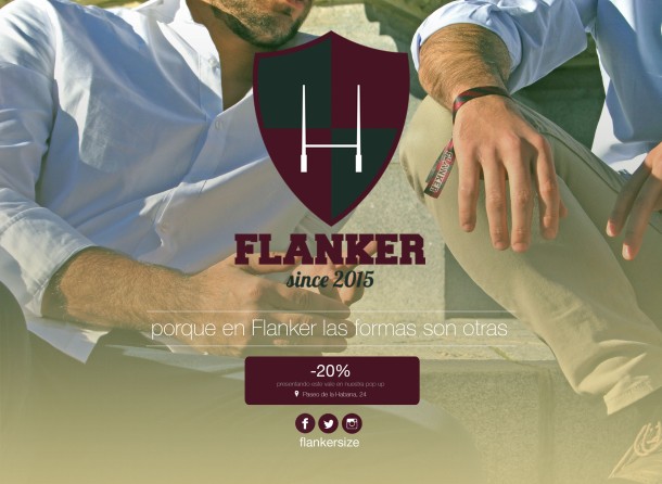
1. Flanker

 Colors: [#1b2e28, #747b47, #b9b27e, #ebefee, #471423]

 Colors: [#3d6c12, #75a628, #a7c93e, #d3e3a0, #a6a7a6]
3. Architectour
Colors: [#000000, #555553, #b8b8c0, #ebefee, #fedab8]
4. everisNEXT

 Colors: [#8da310, #becc6d, #ecf1f1, #96a6a6, #33475f]
5. Land Me Far
Colors: [#2a3d43, #2489a5, #cfdad9, #ffffff, #b59d6e]
6. LS Flamenco
Colors: [#073b46, #2a5e52, #fdefa8, #f9aa5d, #ed7f42]


Number 2 is my favorite.
LikeLike
I will tell them, they’ll like that! Happy 2017 Sally, how are you?
LikeLike
Number 1 is my personal favorite.
LikeLike
I love their logo colors too, can’t blame myself for picking them :P. How are you Rebecca? Happy 2017
LikeLiked by 1 person
The adventures continue, my dear friend. Sunshine in Vancouver and spring is around the corner. Living each day to the fullest. I enjoy your post immensely!!!
LikeLike
I am so glad to read that adventures continue. Spring is one of my favorite seasons of the year, can’t wait for everything to be green again 🙂
Anything you are especially looking forward to?
LikeLiked by 1 person
Yours is the closest to my liking except for the beige or whatever it is at the far right – I’m assuming that comes from the hand. I think I would have gone with a fully B&W version as the hand somewhat distracts, but I’m not the one making the choices. (Note: these days, people strive for diversity and if you are marketing these internationally, you might want to consider removing the hand altogether and replacing it with a travel pouch or something like that.)(Note 2: I’m not an expert in anything and my opinions should be taken with a chunk of salt.)
The rest seem to me as studies in pastels.
Note: I’m a guy, so I call those colors pastels even though they might not be. In my mind, that’s what pastels look like.
Honest, most of those look kind of bland. Not that I have a specific preference (I would know it when I see it). I’ve looked at various color wheels and charts in the past, but the design of the site is what for me makes a given color combination work or not and I think that’s the case here. Most of those sites do not connect with me in a comprehensive way, so individual components – like colors – suffer as well.
Anyway, I’ll keep this in mind if I ever do anything creative.
LikeLike
Hi Emilio,
Your opinions are always strong, you either love it or hate it haha. Architectour is full black and white, despite the hand which gives it some color. But everything else is black 😉
Thanks for your continuous support with the emails by the way.
LikeLike
5 is my favorite… as a photographer 😉
LikeLike
Hi Carl, I like that one too. Happy 2017 by the way. How are you?
LikeLike
Hello, I’m fine and I hope you too! Working hard, enjoying life, images, exhibitions and every moment of the day! 😉
LikeLike
That seems like happy busy 🙂 Any exhibitions in the near future?
I just arrived back to London!
LikeLike
Sorry for answering you so late. In Brussels William Klein till 15 02 – Botanique, Alex Sotch and Herman Selleslags in Antwerp, Jean-Loup Sieff in Charleroi.. exiting times!!!!
LikeLiked by 1 person
Exciting plans ahead! Let me know your thoughts about these exhibitions, maybe one day I’ll visit them too 🙂
LikeLike
I really like number 1, but they are all pleasing.
LikeLike
They are dear friends of mine, I will let them know 🙂
Thanks for stopping by, hope you are having a lovely week.
LikeLiked by 1 person
Pingback: 8 Beautiful SlideShare Presentations That Will Help You Build Yours | Virginia Duran Blog