Picture yourself doing some research about Madrid, because you’re about to spend a few days in the Spanish capital. You find this awesome list of cool spots to photograph and can’t wait to see them in person.
But then, once you reach these places, there it is… DISAPPOINTMENT
Beautiful pictures make people disappointed
Has it ever happened to you that some sunsets just look better from your computer screen than in person? The truth is that beautiful pictures create high expectations of reality and those expectations are not always met, leaving us disappointed.
A few years ago, while writing Top 11 Rooftops of Madrid I realized that one of the things I hated most about finding all these cool rooftops was that the famous picture of it didn’t look as good as in reality. That’s why one of the things I want to avoid in my city guides is spoiling the first impression of the reader.
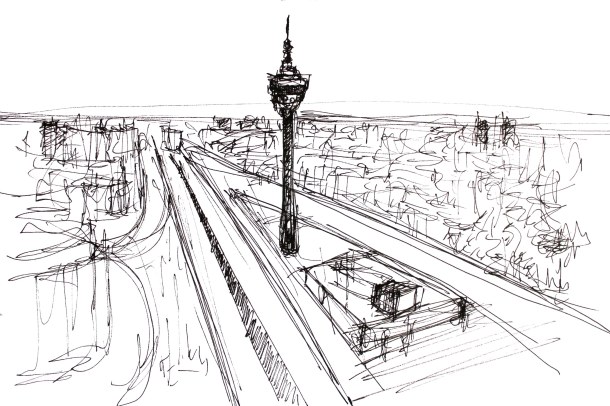
Therefore, in this guide there won’t be any pictures. Not even one.
Instead, sketches will fill every page.
Help me find the style of these sketches for my future guide
Choose 1, 2, 3 or 4 taking into account that the final size will be the size of an Instagram capture on your phone screen
What is the main purpose of having sketches instead of pictures?
- The first impression of the building will be the one you have with your own eyes.
- It’ll be special no matter if it’s sunny or raining, daytime or night time
- Therefore, no disappointment
#1 Black and White

#2 Color

#3 Quick Black and White
#4 Quick Color

Please leave a comment below saying which sketch will both be useful to identify the place and won’t disappoint you. Please note that the size will be like that of an Instagram capture on your phone screen, so quite small.
Thaaanks 🙂

I love all of them to be honest!! They’re great!! But if I had to pick one, it would be #4. It’s very expressive, and I like the fact that is quite sketchy and the background works in a way that the main building resonates. Also, I like that the colour is very subtle at the same time as bright!
But I have to say that #1 is a stunning drawing of Gran Vía!!
Keep up the good work!!
LikeLike
Very true Clara! It’s the most “sketchy” of the list. Will do more drawings to be sure how the style fits within the different buildings. Thanks so much for your insights 🙂
LikeLike
An idea becomes a reality ,a beautiful one.Regards.Jal
LikeLike
Thanks for stopping by Jalal. Which sketch did you like most?
LikeLike
As matter of fact l liked every one of them.Each has its own uniqueness.Regards,
LikeLike
I think that it depends on which artist interprets the building the way that you see it.
LikeLike
Mmm… that’s a good thought! At any cases, the drawing would express some subjectivity from my part. If you had to choose a style for yourself, which would it be? It doesn’t have to be any of this list, any reference could work 🙂
LikeLike
As for the sketches, I liked #1 and #4, in that order.
However, that seems a lot of work. You should be able to take existing photographs and turn them into sketches using programs like Topaz Impressions and Topaz Simplify.
This link:
https://drive.google.com/folderview?id=0BzKL9NgxMBj5U1ZhOS14eC1oam8&usp=sharing
shows what can be done with just a few clicks of the mouse using default settings (highly customizable). It has the original file and a number of variations using canned presets from those programs.
Now, I understand someone wanting to do it by hand as something they enjoy (provided they are capable of it), but if providing hundreds of examples, that takes a lot of time.
Again, not saying you should use a program, and not trying to push Topaz (I have no stake in the company and do not speak for, or represent, them.
LikeLike
I also added smaller versions to show how they might look in a booklet.
LikeLike
I want to change my answer . . . I got the online survey with the smaller sketches, and I think I would definitely go with #4 when in the smaller format. I probably like #1 the best, but in the small format it’s too busy to convey the scene.
Also, perhaps you should have chosen four different versions of the same scene. #4 is nice and clean I presume in part because of the geometry of the building.
How would the first one look if done in the style of the fourth?
Perhaps each scene requires a different look to highlight what makes it a worthwhile photo subject.
LikeLike
Hello Emilio, you’re absolutely right about doing the same building in different styles. Will try that next week as part of the layout discussion. Should have done it in the inverse order. On the other hand, I want to create something that is unique and handmade so no Photoshoped pictures, even if it’s sketchy Photoshop. It’s a personal decission. Thanks for sharing the insights and the program, would definitely use it for other purposes 🙂
LikeLike
I understand completely . . . If I had kept up with my drawing and had developed the skill, I would probably opt to draw as opposed to electronically producing drawings from photos.
LikeLike
Let’s see how it all looks in the page context anyways. Maybe it makes no sense at all! Thanks for all your comments and help!
LikeLike
One other thing . . . yes, pictures do show a high expectation of reality, and yes, someone might be disappointed.
But some might be moved to learn the craft and duplicate that heightened view of reality.
I wrote about that here (for them who might be interested):
LikeLike
What a great idea. You are so right about photography. The editing features can change reality. There is something unique about each of your sketches and it is difficult to rate them as to which is best for your purposes. I think that a blend of colour and black and white would add drama without overpowering. All the very best in your endeavors.
LikeLike
Hello Rebecca, thanks for your insights. I want people to have a unique experience (also a very personal one) by using my guide, so will need to avoid pictures. However, don’t know if using black and white sketches would be enough. Will need to try more versions to be sure. Hope everything is good with you. How is winter going?
LikeLiked by 1 person
Winter is progressing and the days are becoming lighter. I love winter for its reminder to slow down. I love Gandhi’s thought: “There is more to life than increasing its speed.” We have been having lot of liquid sunshine in Vancouver. I love my rain boots and umbrella.
LikeLike
What a nice way to put it! Also, your positivity is contagious 🙂
hope you’re enjoying every day and making the most out of this peaceful winter season.
LikeLiked by 1 person
I would vote for #4. It would be quick, first impression, and Madrid is the kind of place that would need some color to express it better, in my opinion. 😀
LikeLike
Hey there! True what you say about Madrid needing some color. It’s going to be hard to choose. Adding your answer to the poll, thanks so much for your vote 🙂
LikeLike
If they are to be small, then the quick black and white. No sense in too much detail if the pictures are small.
LikeLike
Hello Scott, I completely agree with you. Next week I’ll give some more information about the page layout so we can better discuss the size of the sketch. Anyway, it’s not going to be very detailed. Thanks so much for your vote 🙂
LikeLike
I think that I would go with number 2 and number 1 in that order. I really like the style they have and think that they reflect the personality of the buildings. 😉
LikeLike
Thanks for stopping by and voting, just recorded your answer. It’s going to be difficult to choose. More information about the page layout next week 🙂
LikeLike
That is a great thought. That way you get to experience it the first time through your own eyes which makes the experience all the more special.
I would go with number 2.
LikeLike
Perfect, just recorded your answer. That’s exactly the intention, that everyone would be able to craft their own experience from scratch. Both if they want to read the building story in advance or not and also its physical appearance.
Thanks for your vote 🙂
LikeLike
A mí me gusta la primera. Pero más porque es una de las imágenes que me recuerdan más a Madrid. Lo mismo y esa con un poco de color no queda mal, pero creo que prefiero el sketch en blanco y negro
LikeLike
Gracias Charlie por votar, lo apunto. Quizá hago otra versión del mismo edificio en varios estilos para que se pueda apreciar mejor. En cualquier caso, blanco y negro rules 😉
LikeLike
Virginia… you’re quite a talent! I like #2, though they’re all great. A sense of the landscape and a splash of color helps the viewer to place themselves within the picture. I always so enjoy your posts!
James.
LikeLike
Hello James! How are you? thanks for your kindness, you encourage me to be better every day with my posts. Next week I will propose the page layout for discussion so we’ll get to see this sketch in context. As you say, a splash of color helps the viewer to understand a little bit of the landscape, and that’s always nice. Right now, there are the same votes for color than black and white. It’s going to be harder thank I thought!
LikeLiked by 1 person
Hi Virginia, first time I drop by your blog. Undoubtedly Black & White best fits your concept of not spoiling the first impression. However it would be a pity to squander your talent going for a Quick Black and White sketch! #1 FTW. Beautiful mixture of detail and generality
LikeLike
Hello Chase, I’m glad that you discovered my blog and very grateful that you took the time to vote. Number 1 is also my favorite 🙂
More questions regarding the future guide next week, although there won’t be public so subscribe to the blog to get them if you want to contribute with your opinion 🙂
LikeLike
Virginia, splendid idea! I think may be we should let the buildings decide themselves how best to highlight their individual character. Some may like BW #1, some others a dash of colour #2, the minimalistic lines of #3 or #4… Why not engage more tban one styles?
LikeLike
Hello Lia! That’s a great idea. Actually, no one has suggested it before so thanks for the input! The truth is that I’m drawing more buildings to find out which style is more adequate 🙂 Hope everything is good with you. How is winter going? Are you in Brussels by the way?
LikeLiked by 1 person
Oh, I know you’ll figure it out… and it will be the best 🙂 Yes, in Brussels. I don’t usually move a lot, if I can avoid it, in Jan-Feb. Although winter has forgotten Brussels this year, been springlike almost throughout!
LikeLike
I was asking because I may go to Brussels at the end of February and I’d love some tips on what shouldn’t I miss in the city. Also, I’m working on the map guide and would like to know if you would add any other spots to it. Here is the link https://www.google.com/maps/d/edit?mid=zmd3uAup6Kko.kCkZsHWgedi4&usp=sharing
LikeLike
Nice! Will you stay long? If you have some time, go to Villa Empain (check online if open). Also a definite spot for the guide. You’ve probably been to all these already but: beer/dinner at De Ultieme Hallucinatie. More beer at the Cafe Belga, place Flagey (listed building, spot for the guide). Walk along the etangs d’Ixelles towards La Cambre Abbey. The Abbey itself.
Another favourite spot is the, recently opened, Train World.
More spots for the guide (most of them open to public so you can check them out too):
La Maison Cauchie
Gare de Schaerbeek
Maison Autrique
Bibliothèque Solvay
Hôtel Max Hallet
Museum van Buuren
Wiels
Bibliotheca Wittockiana
Halles de Saint-Géry
Nationale Bank van België / Banque nationale de Belgique
Bozar
Hotel Le Berger
I’m sure I forget many but it’s a good start 🙂
LikeLike
Hello Lia, thanks so much for all your recommendations, I haven’t been to any because I have never been to Brussels 😀
Wow! So many spots I would have missed. I will only stay 5 days so hope to have a high visiting rate! Will update the map soon. Thanks thanks thanks!!
LikeLike
Oh, in that case you’ ll enjoy our Grand Place and Gallerie de la Reine a lot. And beware the pickpockets!
LikeLike
Thanks for your recommendations, amazing spots! I had a lot of fun researching all of them. Hopefully all the houses by Victor Horta are here 😀
LikeLike
You are most welcome! Buuut… not sure all houses by Horta are there. There’s so much Art Nouveau about, we are bound to forget something 🙂
LikeLike
I like quick color (#4) but it depends a lot on each drawing. Which one are you more happy with? Do you need to have them all the same style? I think variety is not a bad thing
LikeLike
Hello Joaquín, thanks so much for your answer 🙂 All of them should have more or less the same style. I think I’d be happy with a mixture of all of them. Little color, not so much detail but not so sketchy in the end because people want to have enough details to know if they’d like the spot or not.
Will let you know more about the drawings soon!
LikeLike
Hi, I’m a little tardy in replying about your sketches, however I like sketch #1. I have been to the Metropolis “corner” and if I experienced your sketch and then went to see the building for myself I would have been blown away as the sketch is a definite representation of the structure yet finer aspects are absent and thus no expectations. The sketch is sterling of the fundamentals yet holds non of the overt depth and hues. Even though I haven’t been there for a couple of years the sketch brings back the experience as my mind files in the colours, sounds and smells. So to recapitulate I like #1 !, very bully !
LikeLike