Despite the use of color in architecture throughout history, modern constructions seem to be a bit skeptical of this design aspect. Contemporary architecture tends to avoid color in general and there are only a few buildings who manage to use tones in the right way. Architects don’t want their buildings to look like a kindergarten experiment and this is why color is probably one of the most debated issues in architecture. However, some recent architects seem to have dealt with color pretty well and these are some examples, among many others.
What do you think about these colorful buildings?
Don’t miss 12 Colourful Buildings Brightening Up London


1. MUSAC (Museo de Arte Contemporáneo de Castilla y León)
Location: Leon (Spain)
Architect: Luis M. Mansilla + Emilio Tuñón
Year: 2004
Brief Description: The facade of the contemporary museum is made of multicolored panels which has certain similitudes to the typical windows of Gothic cathedrals (of which this Spanish region is famous for). In fact, the architects got the inspiration from the main rose window at the local 13th century Gothic cathedral, Santa María de León. Another similar but less elegant building is the Palais des Congrès in Montreal . Read more here.


2. Museum Brandhorst
Location: Münich (Germany)
Architect: Sauerbruch Hutton
Year: 2002
Brief Description: The Brandhorst Museum houses a private collection of late 20th Century and contemporary art, mostly paintings. The scheme consists of a simple elongated building of three interconnecting volumes which are distinguished by cladding of different colors and hues. This is indeed a very rational use of color, you could tell it’s located in Germany. Read more here.
Note: Sauerbruch Hutton architects have many notable buildings which use color such as the Pharmacological Research Laboratories and the Cologne Oval Offices.


3. Musée du Quai Branly
Location: Paris (France)
Architect: Jean Nouvel
Year: 2006
Brief Description: Despite its appearance of a wild, disorganized jumble of colorful boxes, this kaleidoscopic composition is used to highlight the museum’s diverse collections. Concealed light sources, invisible showcases, spiral ramps, shifting ceiling heights, and changing colors combine to ease the transition between periods and cultures. And this is indeed a great way to bond the program with the interior and exterior forms and colors. Read more here.
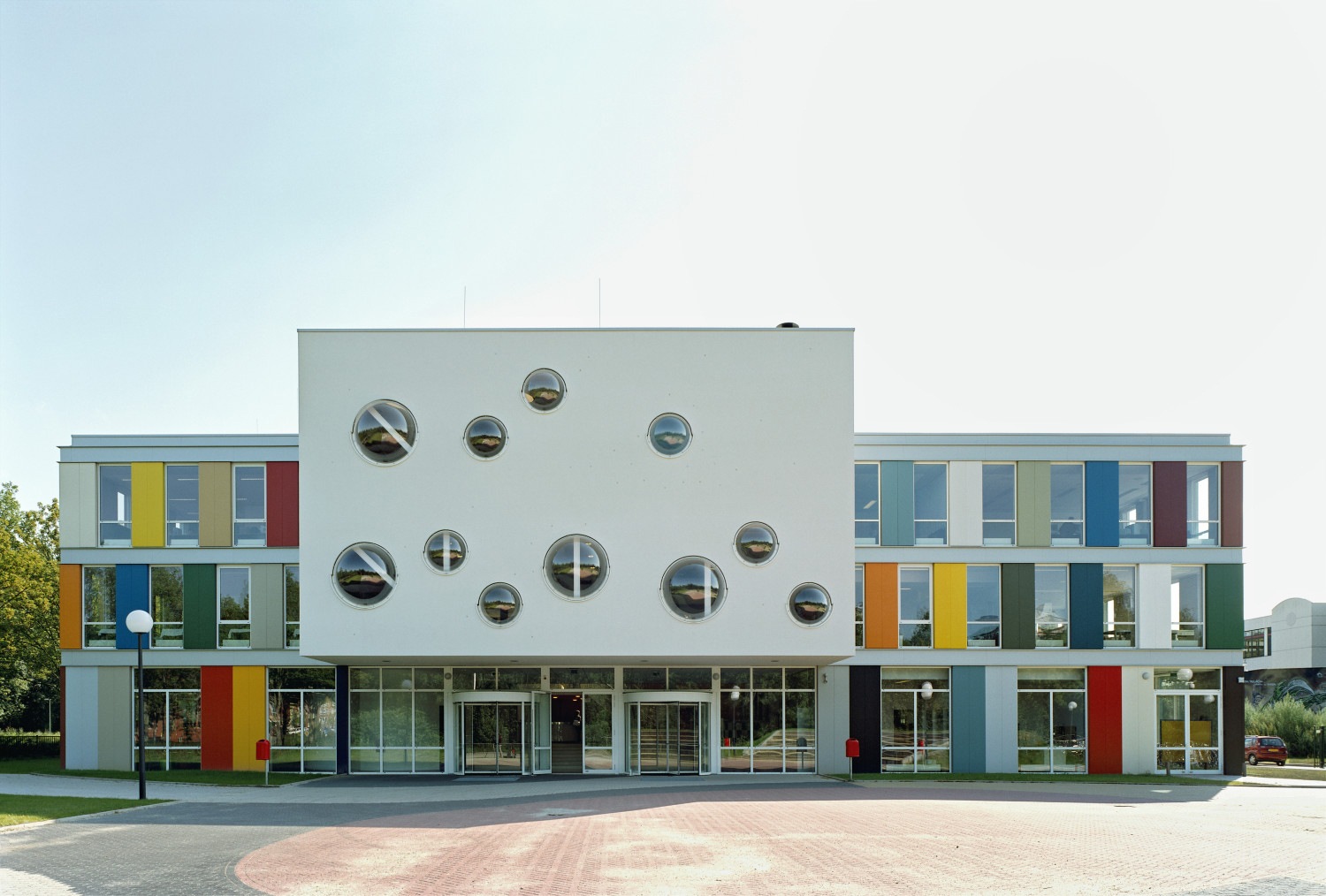

4. Niekee School
Location: Roermond (Netherlands)
Architect: LIAG architects
Year: 2007
Brief Description: Niekee schools is known for distinguishing itself from a traditional school. The exciting, vibrant exterior merely hints at the unusual facilities inside, which is organized around a central area with its open learning centre. The building has been set up this way so that a maximum transparency is reached and interactive relations, learning with and from each other, are promoted. Who wouldn’t be creative surrounded by all this color and amazing spaces? Read more here.


5. American University Of Cairo Campus Center
Location: Cairo (Egypt)
Architect: Legorreta + Legorreta
Year: 2009
Brief Description: The sons of Mexican starchitect Legorreta seem to have inherited their father’s taste for color. This amazing complex manages to adopt a modern architecture concept to vernacular materials and colors. The composition of blues and oranges is simply amazing, like all of their buildings. Read more here.


6. College of Art and Design of Toronto
Location: Toronto (Canada)
Architect: Aslop Architects
Year: 2004
Brief Description: The Sharp Centre for Design was built to accommodate an expansion of the Ontario College of Art & Design in downtown Toronto. The center is a two-story, black and white rectangular volume set atop brightly colored, 26 meter tall columns, straddling existing buildings of the College. This bold expansion is in some way proudly soars above, which can be criticised, but modern art is all about this. Read more here.


7. Porta Fira Hotel
Location: Barcelona (Spain)
Architect: Toyo Ito and b720 Arquitectos
Year: 2010
Facade Description: The project consists of two towers that perform a subtle dialogue between them. The hotel’s skin is made of a system of red metal tubes placed with a certain inclination. The other tower however, uses the red tubes only on the core (inverse system). The use of color represents the relationship between the two buildings and this is probably why the architects only used one color. Read more here.


8. Sugamo Shinkin Bank, Ekoda Branch
Location: Tokyo (Japan)
Architect: Emmanuelle Moureaux Architecture + Design
Year: 2012
Brief Description: Sugamo Shinkin Bank is a credit union whose motto is: “we take pleasure in serving happy customers.” The design responds to the client’s expectation: “creating a bank the customers feel happy to visit” and color is one of the main resources of the design. What I really like about the building is that the pillars are also used inside, giving it a sense of “transparency” and “continuity” that is indeed positive for a bank. Read more here.


9. Terminal 4, Barajas Airport
Location: Madrid (Spain)
Architect: Richard Rogers + Estudio Lamela
Year: 2004
Brief Description: Transitions between spaces are considered as if a person changes time zones gingerly on a travel. The subtle change in colors punctuate this change. But this statement, my friends, is not true. I had the chance to hear the real story and architects won’t be surprised. The architects didn’t know which color to choose so they brought beams of different colors, again and again. The final result? what you see. Read more here.


10. Simmons Hall at MIT
Location: Boston (US)
Architect: Steven Holl
Year: 2002
Brief Description: The new undergraduate dormitory at the Massachusetts Institute of Technoloy, consists of a perforated, monolithic box with contained spaces that curve and unfold towards natural light. Where’s the color? you’ll wonder. The use of color here is very subtle, it can only be perceived from certain angles. Given that is a dormitory full of students this can have a lot of meanings. I’ll keep mine for my own. Read more here.
![]()
![]()
11. Pixel
Location: Melbourne (Australia)
Architect: studio505
Year: 2010
Brief Description: This is a risky project, however, the architects designed the facade as a system of perimeter planters, fixed shading louvers, double glazed window walls and solar panel shading. They developed a complex yet simple patterning system to engender the project with a human scale ‘flow’ of textures. Read more here.


12. Nestlé Chocolate Museum
Location: Mexico City (Mexico)
Architect: Rojkind Arquitectos
Year: 2007
Brief Description: This museum is designed in order to deliver the most pleasant experience towards the brand. This playful folding shape is evocative for kids, of an origami shaped bird, or maybe a spaceship. From the moment you enter the space, you start the voyage into the chocolate factory. Even if this seems superficial, this building is extremely effective on its purpose. Read more here.
If you liked this article you may also like 9 Successful Colour Combinations for Web and Graphic Design


Fascinating collection. I am a little uncertain about too much colour on a building. I do like the American University in Cairo and number 3, the Museum in Paris. The bank interests me a lot, especially as I have been considering doing a post on one of our banks which does a very good job on interior design that does exactly this… creates “a bank the customers feel happy to visit”
LikeLike
Yes, some of these buildings may have too much color on their facades. Where’s the limit? I think it depends on the user. My favourite one is the University in Egypt by Legorreta, the architect is a genius when it comes to light, space and color. He has many cool buildings and houses http://st1le.wordpress.com/2012/05/01/the-sotogrande-house-by-francisco-cortina-ricardo-legorreta/
And color is a very interesting resource for public buildings like banks and hospitals. What does your bank look like? I encourage you to write about it 🙂
LikeLike
Love the colours in the sotogrande house. And I agree re colours for banks and hospitals. I wonder what colours will be part of our new hospital/medical precinct. My bank looks unremarkable on the exterior but inside the colours are muted blues and grey and white. I find it pleasing and relaxing.
LikeLike
So Cool!
LikeLike
Thanks Liu 🙂
LikeLike
Cool colors!
LikeLike
Cheerful architecture 🙂
LikeLike
I suppose that I’m a minimalist when it comes to too much color, because it must blend with the rest of the cityscape. Sometimes it works well and others it takes over the visual landscape. Truly, the architects must take that into consideration, and therefore there is a blatant statement when it is too overpowering. On the other hand in certain locations where it is warm yea rround the color is part of the culture, and works. Enjoyed the post.
LikeLike
I couldn’t agree more with those words. None of the buildings I’ve design have any colors, I prefer to have the raw material visible, and those are always brown or grey. However, I’ll admit that some colorful buildings are quite effective for their purpose. I tried to explore some of them with this post.
Thanks for sharing your views, always welcome 🙂
LikeLike
Two of favourite things colour and architecture.
LikeLike
Then this is the post for you 🙂
Any favourites? Mine is the orange one in Cairo
LikeLike
Really striking. We should use more color everywhere; most cities look sterile . . . If it weren’t for the association rules, I might consider something striking for the outside of our house.
Probably will when we know we’re not moving again (resale value, and all that).
LikeLike
Colorful architecture=cheerful architecture! It’s true that color can change the way we perceive our homes and even our neighborhoods, isn’t it? Have you heard about this project in Beirut? http://dihzahyners.tumblr.com/
LikeLike
Neat. Is that an offshoot of that one person (my memory fails me), some old guy, who painted some stairs, and the city repainted them to a bland color, and then people started to paint stuff all over the place?
I don’t remember it as being in Beirut, but it could have been. I thought I remember reading it sparked a movement in other countries.
Perhaps it will come here.
LikeLike
I’m sure there must have been a similar movement before. What this group of young people do is paint stairs as a way to complain about government abuse and other political issues in Beirut. I’ve heard the stairs get repainted by officials and they repaint it again. I like the concept and hope they are doing similar things around the world!
LikeLike
Cuando recibo el email de tu entrada no la puedo ver entera desde el email. Así que en cuanto he visto el título he dicho…”Si no está el Museo de Múnich se lo tendré que poner de ipso facto” pero.. ¡ahí estaba! :))
Me ha gustado mucho el Museo de Nestlé :):)
LikeLike
Marta! Fíjate que no había caído, pero menos mal que lo he puesto 😉
El Museo Nestlé me gusta mucho también. Me da la sensación que van a tener tabletas de chocolate por todas partes dentro hahahaha
Si vuelvo a Méjico lo visitaré fijo. Y mi favorito es el de Legorreta, en mi opinión, es el mejor de todos, son genios en esa familia!
LikeLike
Oh, wow! I love seeing bright colours on buildings but, unfortunately they never have the same effect here in UK where the sun doesn’t shine as often. Great photos.
LikeLike
Oh! But rain is not a problem when it comes to color 🙂 The Niekee School is in the Netherlands and they don’t get much sun either. I remember some colorful buildings in London when I visited 🙂
LikeLike
I love colour so I like them all but prefer 1, 2, 4, 8, 9, 11, 12
LikeLike
That’s a very good number of buildings to “prefer”. It’s actually nearly half 🙂 I forgot to add this one http://www.peripheriques-architectes.com/atrium-universit%C3%A9-pierre-et-marie-curie-upmc-campus-de-jussieu what do you think?
LikeLike
Yes I like it, it looks better inside I think, although the colours bring the grey alive at night ;). My brother went to Warwick University maths dept. and I always loved their drip paint wall.
LikeLike
I had to Google that one. You mean the mural by artist Ian Davenport? The poured paint? Does it have texture or is it flat?
LikeLike
I like all of them except Simmons Hall at MIT. That one looks like an architect who wants to use color but is afraid. 🙂 The Porta Fira Hotel seems to have the “humanist” symbol on one building (probably not intentional). My favs are 1, 2, 3, 5, and 8.
LikeLike
Wow! I didn’t realize about the humanist symbol haha that was a witty one. I really like 5 and 8 too. And yes, it looks like someone was afraid of going full with color, but also with a series of large openings that would cut into the building. After all, maybe it was more of a technical problem rather than lacking colorful intention 😀
LikeLike
By the way, I just learnt to add hyperlinks 😀 I was very curious to see you always used them instead of pasting the link!
LikeLike
That link you posted made me like Simmons Hall a lot more. 🙂 You’re right that it was likely more of a technical problem.
Why I always hyperlinked? Yeah, I’ve spent a LOT of time on the Internet…Probably too much.
LikeLike
Great site, Virginia. Thanks!
LikeLike
Thanks for your kind words!
LikeLike
Stunning architect and parade of colors.Cheers.Thank you for liking my post.Jalal
LikeLike
You’re welcome! Have a good day 🙂
LikeLike
Personally I love modern architecture because the use of color!
LikeLike
But there aren’t so many good examples if you think about it!
LikeLike
Loved this post. Too much color can be unnerving, that is what I think. xxoo, Amy
LikeLike
Hello Amy, I agree with you. But a little bit of color in architecture is welcome. Thanks for stopping by 🙂
LikeLike
Oh, you are talking to one who loves color. Yes, I would like to see more color in Archetecture, especially locally where I live. I am fascinated by the colors I see Southwest and West Coast of USA. I really enjoyed looking at the photos you presented. This means of communication gives so many an opportunity to see parts of the world that one wouldn’t be seeing otherwise. Thanks again!!! xxoo, Amy
LikeLike
Here I am, saying a great big thank you for following my blog, Petals Unfolding. I am truly touched. May it be a source of inspiration to you in your own life. Many Blessings, Amy
LikeLike
Amy, thanks so much for your kind words, I’m sure it’ll be a source of inspiration! Have a nice day 🙂
LikeLike
You have a great weekend!!! Love to you, Virginia! (((HUGS))) Amy
LikeLike
Love your posts, so well research and informative! 🙂
LikeLike
Thanks for your kind words 🙂
LikeLike
wow!!!!this is beautiful.Looks like a rainbow and so attractive.combination of this much colours?never seen before,thank you for this wonderful article.
LikeLike
Katie, glad to hear you enjoyed these colorful buildings. Any favourite on the list? 🙂
LikeLike
I am glad that such kind of art and livings with art may exist. it should be promoted more and more to other governments and investors. This kind of architecture in combination with otter variants must be great for living it. I envy positively those who are able to use these infrastructures. Conclusion for me : yes we can ,yes one is able to do
LikeLike
Colorful buildings lead to a colorful life, don’t you agree? It’s not easy to design those in the right measure, sometimes it can feel too much. But this buildings on the list are beautiful in my opinion 🙂
Any favorites for you?
LikeLike
hello virgina , I am not fully agree 🙂 Its beauty will maybe not stand but living and working in this atmosphere could stand day by day . My favorite, eeuu, wel that is simple, I am travel a lot for work and therefore I am albe to image the airport construction to be my favorite . But I am sure that the others are becoming more intens too if I was operating or living with them as well.
LikeLike
Madrid’s airport is absolutely my favorite building on earth. I visit it quite frequently! Thanks so much for being part of the conversation 🙂
LikeLike
Reblogged this on bbylois and commented:
dear governments and architects. Time to face this.
LikeLike
Reblogged this on MyleneFengDesign and commented:
Good reference.
LikeLike
Missed a few:
http://www.architecturaldigest.com/gallery/most-colorful-glass-buildings-slideshow/all
http://amazingonlinemagazine.com/15-most-colorful-buildings-in-the-world/
http://blazepress.com/2014/10/23-colourful-buildings-world/
LikeLike